Tuesday, 14 June 2016

I've been working on my layouts at the moment. I think this so far will be the general look of the pages of the journal. during the layout process i have come to the realisation that i should have really worked on layouts a lot earlier and because I had already done a few illustrations it was harder for me to incorporate them in a natural, fluid way so it was quite tricky fiddling around with them. By removing some of my original food illustrations and re drawing some other objects in I was able to get a better feel and mould the smaller illustrations roughly  around the bigger ones instead of dealing with objects that had already been coloured and cleaned up making them less flexible when i want to change things.......
I feel a lot better about this layout and because i didn't have any polished smaller illustrations done it was easier to create a better flow instead of trying to play Tetris with them... this is definitely the method I will be using next time.
so far these layouts are close to what I want them to look like apart from the few changes ill probably shift around in the later stage (like the texts).  

Monday, 13 June 2016

working on the layout is proving challenging and is probably one a the most important things i need to get right!!!!! having time to play around is good but trying to figure out what goes where and how the viewer will look at the page is a bit intense and interesting and I believe if I can spend some quality time asking advice and doing research on what can make my layout really strong i will be able to use this knowledge for years to come so hopefully i can nail this!! fingers crossed...

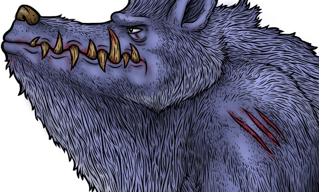
These close ups are to show my line work which i have tried to make an iconic part of my illustrations. 
I found that even when i was working on small characters it took a while because i had to experiment on my line quality and how to portray the character being hairy with out the thick dense lines consuming his body. 
This was one of my first coloured characters and i do think its not as strong as my later ones.  
while working on this creatures line work i had quite a bit of trouble deciding how i would imply spots with out making it look like chunks were missing from his fur coat.
I did struggle with clouring this creature and really didn't want him to be to dark especially compared to the other characters, and because i started him with a darker blue colour i really had to play around with how I would lighten him up.. i also realized i should have taken more care in colour choice for the overall look and how the characters would compliment each other on the same page.

I have finished my creatures line work, colour and shading. So far i have finished 8 creatures, i would have really liked to get more creatures finished because i had some concepts i really liked and wanted to do but unfortunately  because the line work has taken me so long due to my OCD nature.... i haven't done as many as I originally thought, also I haven't played around with colour and shading much which was an awesome time to try get familiar with and was fun but did take me a while... I am happy with most of my creatures and with the remaining time i will try get a really solid layout for my journal pages.