Tuesday, 22 November 2016

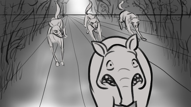
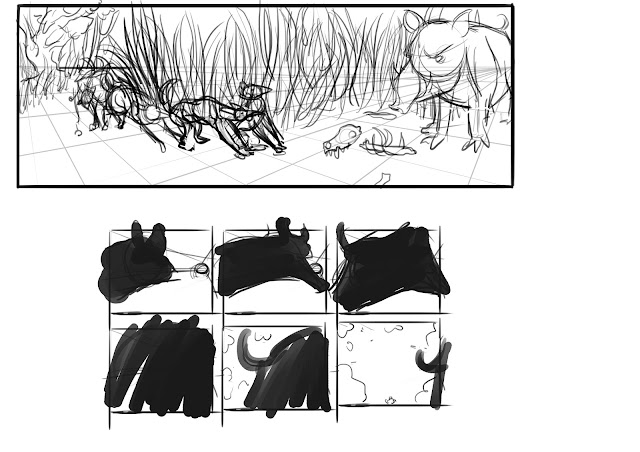
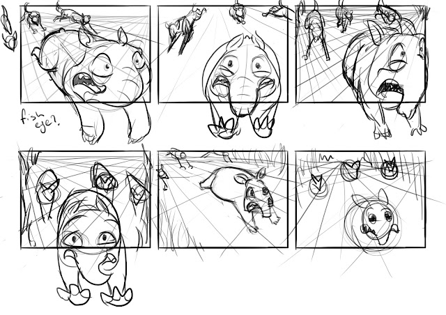
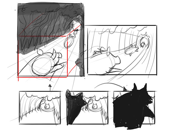
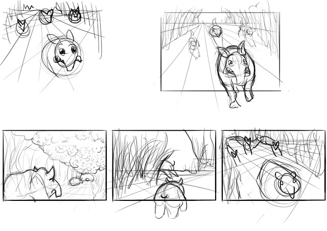
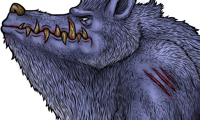
I was really happy cleaning up some shots and how they turned out. 
I really tried to capture a lot of character and personality in the animals and i feel like in my first 3 shots I did what i wanted.
I spent a longer time than expected working on my wolf run cycle but when i had finished it i was super stoked it came out better than i expected 
Frans taught me the method of using a bean shape while animating which really helped in all my shots.

Tuesday, 8 November 2016


all my BGs are finished they were dont awhile ago just haven't posted them. I dont know if i will have time to further work on them and if they should just remain black and white solid colours.

Tuesday, 13 September 2016

BG almost done just need to focus on the colouring, shading and lighting. based off one of my colour studies. happy with the colour scheme at the moment.
another BG that should be done soon just trying to add small little elements that will add to the feel and look of the overall environment.

A lighting study. BG art is fairly new territory for me so really want to get the right colour scheme to enhance my animation and really adapt the lighting and environment to suit the pace and anticipation of my short film. If i go with a shady light it will hopefully create a uneasy feel through the shadows  and help with the anticipation of the chase.
Some more rough BG layouts and lighting explorations trying to explore different perspectives and interesting view points to help with the overall look. 

Some of my original wolf concepts i forgot to post done a while ago now.... had fun exploring different shapes,
Quick wolf run concept keys. and side profile shot of wolf. 
My Tapir character model sheet. Need to do a page of key frames of this character before i head to animation.

Sunday, 28 August 2016

 week 06 
these are some of the story board panels i am adding into my animatic.
Add caption
week 5-  23/08/2016

this is a head study page. trying to get the best head shape and know the ins and outs of it!


These are some rough story boards i have been doing to try touch up my Animatic. I have been trying to replace the weaker shots in my old animatic so the shot movie altogether will look as refined as possible and keep up the anticipation which is what im going for.


Tuesday, 23 August 2016

18/08/2016 week 04


This was a bunch of concept tests with colour, ears and different snout shapes. These dog concepts all have an overall similar look to a dog which i was originally happy with but I took a few steps back and currently trying to redesign the head to get more of a wolf feel.
Ive been focusing on the head a lot and really trying to know the ins and outs of the shape which has proven to be a bit challenging especially in trying to find the fastest method to quickly whip up different angles. I am a lot stronger with the side profiles and because i have mainly been focusing on them i have neglected the other angles which have needed equal attention so I will be trying to focus on the general shape of my character and dropping the detail while i discover the perfect shaped head for my wolf.
I was originally going to do a boar character but ive changed it to a tapir for no major reason except i think they are super cool and can easily fit into the same size and similar movement as a boar. These concepts are not quite what i want but I  am getting a rough idea of how i would like this character to evolve. Finding anatomy reference is a little harder with the Tapir compared to the wolf which means i havnt had as much practice and knowledge on the mechanics of its bones and muscles structure so i do think i need further investigation and a lot of live action reference.
This was my original half done turn around before i decided to change up the head and I have also been trying to simplify the shapes so i will be able to animate him easier. I feel like ive spent a long time on the character development which i didnt take into consideration at the beginning but i really want to know the creature and its movement inside out so i dont have a lot of trouble while animating and can go into it confidently that i know where the anatomy and weight is carried.   
Frans told me about practicing a lot of gesture drawing from wolf documentaries and videos to really start getting a better understanding of the movement and perspective changes which has really helped a tone! I do think i need to do this a lot more for the practice so hopefully i can get more of these pages done quickly!!
these were some emotion studies on my wolf character before i decided to change my design..... looking back now i really liked the look of a few of these but whats done is done hopefully i dont waist to much time and finish the characters asap because BGs and animating will take a long time. 

Tuesday, 16 August 2016

Tuesday, 9 August 2016

For my wolf characters I need to find easier methods for animating them. I have studied their joint movement and looked and different ways to simplify their body shapes. Ive learnt a lot about how they move and have a better idea of how Im going to tackle this in animate.
Top wolf is a made up character using the knowledge from previous studies to see how i could pull it off, I want to go with a slimmer wolf  so i can really show off the muscle structure underneath and avoid the hassle of animating a lot of wavy fur. the other wolf is just a test concept to see how fur does give volume to the animal and to see how much fur actual covers the wolf. 
This is a further exploration of the 2nd wolf and an anatomy study to learn about how certain muscles show through the fur. I had a lot of fun doing this and will keep studying the muscle structure in order to recognize the muscle shapes to push my character design further and to understand the mechanics a wolves movement better.
A front study of the wolves muscle and skeleton structure. this will really help me when im doing harder poses like a front on leap forward. 
The different studies altogether! I am really enjoying studying the wolf and think this is a really great way to learn about this animal in depth and I will be able to use this almost like a model sheet when animating and needing reference for my cartoon wolf.
still need to do the side view of the skeleton just to give me better understanding on the mechanics of the structure movement. This page only took me a few days so i will be pushing onto more of a finalized wolf character design as soon as possible.

DRAWING BOOK CONCEPTS & RESEARCH

A small study done while watching a wolf documentary to observe their movement and behavior.  
Rough concept page for my wolf character.
Had a lot of fun studying the  wolf skull, it is a shape i need to get familiar with. and a few other drawings of wolves (different types).
more rough concepts trying to discover what look i would like to go with and playing around with different shapes. I think i need to go a little scarier with the concepts to suit my short animation better.

Tuesday, 2 August 2016

I finished a background (test) for my animation short which didn't take a lot of my time. Still unsure if this is the style i want.. its very cartoony.  With this BG I decided to play around with the line work colours instead of going with the typical black lines, I think this has helped me not go too dark with shading?...     still unsure about the light source and have to take into consideration how my character will look with his shadow and  lighting on the body.  

Tuesday, 14 June 2016

I've been working on my layouts at the moment. I think this so far will be the general look of the pages of the journal. during the layout process i have come to the realisation that i should have really worked on layouts a lot earlier and because I had already done a few illustrations it was harder for me to incorporate them in a natural, fluid way so it was quite tricky fiddling around with them. By removing some of my original food illustrations and re drawing some other objects in I was able to get a better feel and mould the smaller illustrations roughly  around the bigger ones instead of dealing with objects that had already been coloured and cleaned up making them less flexible when i want to change things.......
I feel a lot better about this layout and because i didn't have any polished smaller illustrations done it was easier to create a better flow instead of trying to play Tetris with them... this is definitely the method I will be using next time.
so far these layouts are close to what I want them to look like apart from the few changes ill probably shift around in the later stage (like the texts).  

Monday, 13 June 2016

working on the layout is proving challenging and is probably one a the most important things i need to get right!!!!! having time to play around is good but trying to figure out what goes where and how the viewer will look at the page is a bit intense and interesting and I believe if I can spend some quality time asking advice and doing research on what can make my layout really strong i will be able to use this knowledge for years to come so hopefully i can nail this!! fingers crossed...

These close ups are to show my line work which i have tried to make an iconic part of my illustrations. 
I found that even when i was working on small characters it took a while because i had to experiment on my line quality and how to portray the character being hairy with out the thick dense lines consuming his body. 
This was one of my first coloured characters and i do think its not as strong as my later ones.  
while working on this creatures line work i had quite a bit of trouble deciding how i would imply spots with out making it look like chunks were missing from his fur coat.
I did struggle with clouring this creature and really didn't want him to be to dark especially compared to the other characters, and because i started him with a darker blue colour i really had to play around with how I would lighten him up.. i also realized i should have taken more care in colour choice for the overall look and how the characters would compliment each other on the same page.